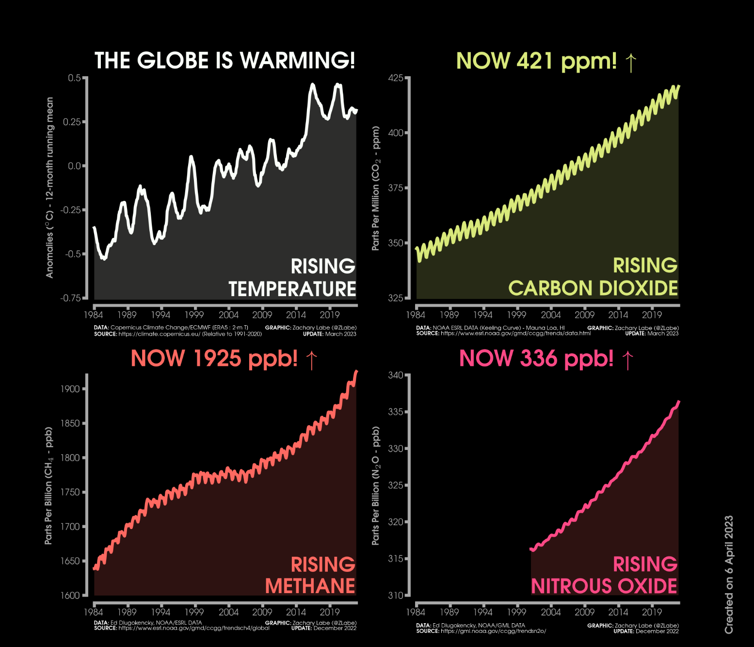
This graphic shows four line graph time series and each are monthly from January 1984 through March 2023. The first graph is a 12-month running mean of global mean surface temperature anomalies. Anomalies are computed relative to a 1991-2020 baseline using ERA5 data. The second graph is monthly carbon dioxide abundance. The CO2 graph is the Keeling Curve. Current levels are 421 ppm. The third graph is monthly global methane abundance. Current levels are 1925 ppb. The fourth graph is monthly global nitrous oxide abundance. Current levels are 336 ppb. The three greenhouse gases show seasonal cycles and long-term increasing trends using data from NOAA ESRL. The global mean surface temperature anomaly record also exhibits decadal variability and a long-term increasing trend. All graphs are rising and shown in four different colors, including white, yellow, orange, and pink.
https://fediscience.org/system/media_attachments/files/110/245/380/025/814/220/original/ccc0d1b8590a77e5.png